Someone’s Gone And Mapped Out Rental Prices Across Australian Cities To Totally Ruin Your Day
SYDNEY. IT'S TIME TO TAKE TO THE SEA.

Whether you’ve just left home and are throwing more than half your shitty cash-in-hand wage on a house that’s about to be demolished (*waves to self in 2009*), or have recently upgraded apartments in the inner suburbs to something that doesn’t have its own ecosystem on the bathroom ceiling — it’s no surprise that rental prices are fucked. With the vast majority of Australians densely packed along the coastlines and beat-up terrace houses of major east coast cities, demand is through the roof and young people and low income earners are suffering the worst of it.

A couple of months ago, Australia’s first rental affordability index by housing advocate National Shelter illustrated much of this. An average renter in Sydney’s inner suburbs, they found, will devote 60 percent of their wage to rent and is quickly getting edged out of the city altogether. In protest of this (and the generally shitty treatment many renters receive from their landlords and real estate agents) some Greens MPs are working towards changes in tenancy laws and the NSW government have regularly acknowledged the problem without putting any real solution forward.
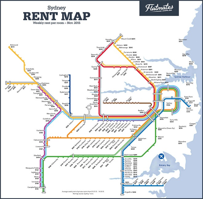
By the way, if it seems like I’m focusing an awful lot on Sydney, there’s good reason for that. As Flatmates.com.au has so helpfully pointed out in a series of maps released late last year, living in Australia’s biggest and most iconic city is the real-life equivalent of willfully landing on Mayfair with a hotel each and every month.
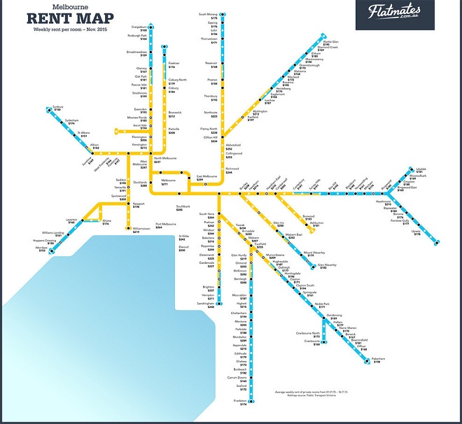
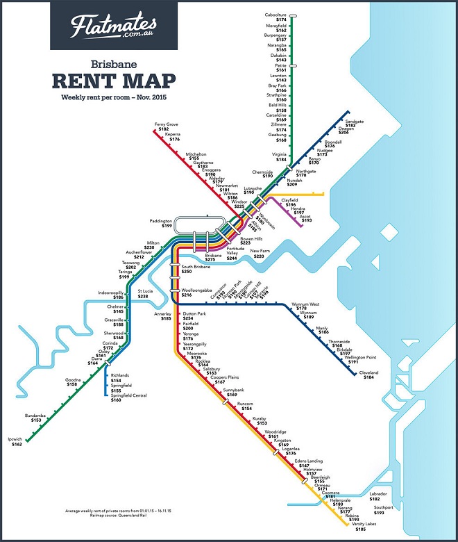
The figures over each suburb are based on the average rents of properties listed on their website (per room/person) in these areas and make a fairly compelling case for taking to the sea. Especially when you put the data next to that of Australia’s other major cities. The flat-sharing site has also made (comparatively cheaper) maps of both Melbourne and Brisbane.
Brisbane has never looked better.
–
h/t BuzzFeed


