Meet Pantone, The Company That Owns Almost Every Colour You Can Imagine
They announced their iconic 'Colour Of The Year' last week. But who even are they?

Depending on what circles you run in, you might have recently seen the name Pantone come up in your newsfeed. This is because the company prophecised last week that Pantone 18-1438 – or simply Marsala – will be the next ‘Colour of the Year’ for 2015. Cue trumpets.
If you’re not familiar with that exact hue, Marsala is a “naturally robust and earthy wine-red” intended to “enrich our mind, body and soul”, according to Pantone’s executive director Leatrice Eiseman. Or perhaps you see it more as a subtle blend of dried blood and rust reminiscent of jam, as I do.

The arrival of Pantone’s Marsala heralds the end of 2014’s Radiant Orchid (purple, really), which means soon every jumper, lounge-suite, and necktie of the New Year will be in this smoky shade of maroon. So long live Marsala and it’s evocation of pomegranates and terracotta pots.
But who exactly are these Pantone guys, and when did they become the divine authority on colour?
–
Colours Inc: The Pantone Matching System (PMS)
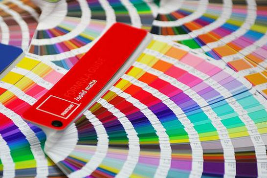
The real flesh and blood of Pantone is what the company calls their Pantone Matching System (PMS). This is basically a universal, standardised archive of every tint, hue and shade of colour imaginable.
From the rich brown crème of a coffee, to the exact pigment of your skin – Pantone will have assigned it a name, a reference code and printing formula. The application of Pantone is used globally – mainly in printing – because Pantone pre-mixes each individual PMS colour to exact precision, instead of blending them together with separate colours as used in CYMK or RGB methods.
This is why Pantone is widely revered, as manufacturers around the world can use Pantone colours as a universal point-of-reference for colour consistency. Also, Pantone is responsible for most of those cool colour-swatches you find at paint stores.
–
Colour As Intellectual Property
However! What makes this interesting is that Pantone doesn’t just give away this information for free – quite the opposite. As defined in Pantone’s Terms of Use, their exhaustive collection of colours is heavily protected, considered their “intellectual property” and copyrighted.
So while anything naturally occurring, like the frequency of light, can obviously not be owned – Pantone does, completely legally, own their names. And they will sell them to you, for a fee.
But why don’t people just try to match colours themselves? Well, it turns out that can be more tedious than difficult. Colours can simply vary slightly on different monitors and printers, while subjective terms like ‘sky blue’ can be miscommunicated without an exact reference number. So it’s really just a hell of a lot easier to use Pantone colours.
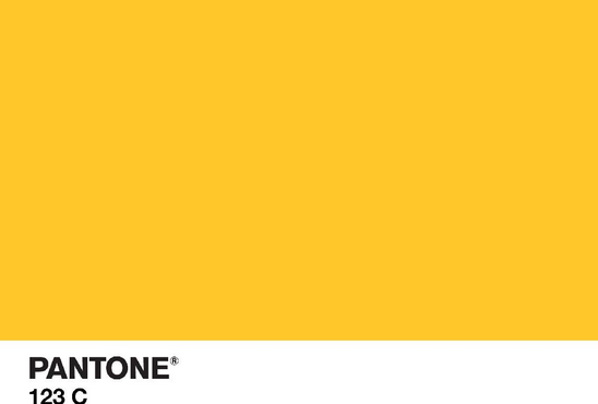
For example, let’s say you’re a global corporation like McDonalds and you want to ensure that the specific yellow of your iconic arches are exactly the same around the world. By turning to Pantone and paying them for use of standardised colours, McDonalds then doesn’t have to trust each independent manufacturer with producing the same colour. Instead, McDonalds can use Pantone 123, a nice French-fry gold, as the exact yellow to be used in every case of branding and printing.
When you really begin to look for Pantone, you’ll discover how ingrained their colours are into almost every facet of everyday life. The blue background and red Union Jack in our Australian flag use Pantone 280 and Pantone 185, the emerald-green in Starbucks is Pantone 3298C, and the warm orange in our beloved Penguin books is Pantone 1505.
However, when a colour becomes so synonymous with a brand itself, it can result it some peculiar, and somewhat abstract lawsuits. For even though a corporation cannot own a colour, they are allowed to trademark it if they can justify that it represents their brand. But a colour can only be trademarked within its relevant industry (so don’t worry, go nuts painting your bedroom ‘McDonalds yellow’ at your will).
–
Purple Chocolate And Green Apples: Companies Warring Over Colour Rights
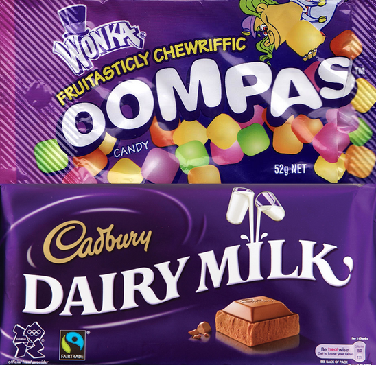
One of the more lasting legal disputes over colour – lasting ten bloody years – occurred between Nestlé and Cadbury over the colour purple (or Pantone 2685C). There’s a reason why that deep purple evokes in your mind a big hearty slab of Willy Wonka chocolate, because ever since 1914 Cadbury has wrapped its confectionery in that very colour.
But the Willy Wonka Candy Company we associate with it is actually owned by Nestlé instead. So in 2004 when Cadbury successful trademarked Pantone 2685C, it ignited a furore of dummy-spitting and tantrum-throwing from Nestlé. Because, as you can see below, both confectionary companies use almost identical colours in their packaging.
Over the next decade Nestlé threw every hearing and appeal it possibly could at Cadbury until finally, in October 2013, Nestlé won and Cadbury lost its trademark rights. Ever since, Cadbury doesn’t seem very pleased with Nestlé. Cadbury even launched a sort-of revenge lawsuit at Nestlé, attempting to wrestle from them their trademarked ‘Kit-Kat’ shape – which Cadbury lost.
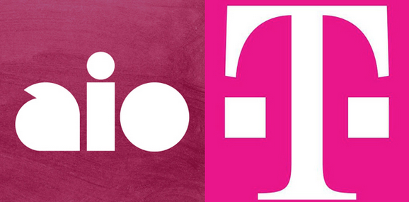
T-Mobile have also tried to sue anyone they can over its particular shade of magenta (Pantone 676C). They even threw a lawsuit at Engadget Mobile – a completely different kind of company – who responded by basically rolling their eyes and giving T-Mobile the finger.
But earlier this year in February, T-Mobile accused Aio-Mobile, an AT&T subsidiary, of clearly attempting to infringe on their trademarked pinky colour with their (completely different) shade of maroon. T-Mobile accused Aio-Mobile of trying to hitch a ‘free-ride’ on their success by copying them, to which Aio-Wireless basically responded like this:

“T-Mobile need an art lesson. Aio doesn’t do magenta” said Aio spokesperson Kathy Van Buskirk. Though weirdly enough, T-Mobile actually were successful in their case and Aio Wireless was forced to change their branding colour to a slightly richer red. What do you think though; were the two even slightly the same?
Earlier this year in July, Multinational British Petroleum lost an even longer lawsuit than Cadbury and Nestlé’s. This one lasted for twelve, tediously insane years over a shade of light green (think of the amount of money that went into these legal fees).
The reason for the feud was that Woolworths had been vehemently trying to prevent BP from trademarking the green (Pantone 348C) in their flower logo. Woolworths claimed that it was too similar to their own apple logo (I thought it was a pumpkin), which goes to show corporations will fight for colour control even if across entirely different industries.
But while some of us might say look upon these schoolyard rivalries as trivial, we sometimes don’t realise how heavily we associate these colours with their brands. The crisp ‘Tiffany Blue’ owned by Tiffany & Co, wrapped around each piece of jewelry, stirs in us every time a touch of elegance, of a regal life. The vibrant ‘Target Red’ owned by Target, which is used so overwhelmingly in their advertising that we think of no other brand when we see it. Even ‘Barbie Pink’, which you think adorns every child’s doll set, is actually owned by Mattel and exclusive to their line of toys.
So the next time you’re walking around, gazing upon something as naturally beautiful and unassuming as colour, remember there’s no such as thing as ‘free’.
–
Jack Callil is a male human, freelance writer, and illustrator living in Melbourne. You can follow him @Jack_Callil.


