Congratulations Australian Media, You’ve Somehow Managed To Make The Census Racist
This is why we can't have nice things.

Yesterday the Australian Bureau of Statistics released the first set of data from last year’s census. Census release day is always fun, especially if you’re a giant nerd like me. It only comes around once every five years, like a sort of quinquennial Christmas, and we get to do interesting deep dives on what modern Australia really looks likes.
But in the grand Australian tradition of ruining nice things, sections of the media have decided to take the fun and joy out the census by making it… racist. How can a census be racist? After all, isn’t it just a stack of demographic data?
Strap yourself in.
The Asians Are Coming!
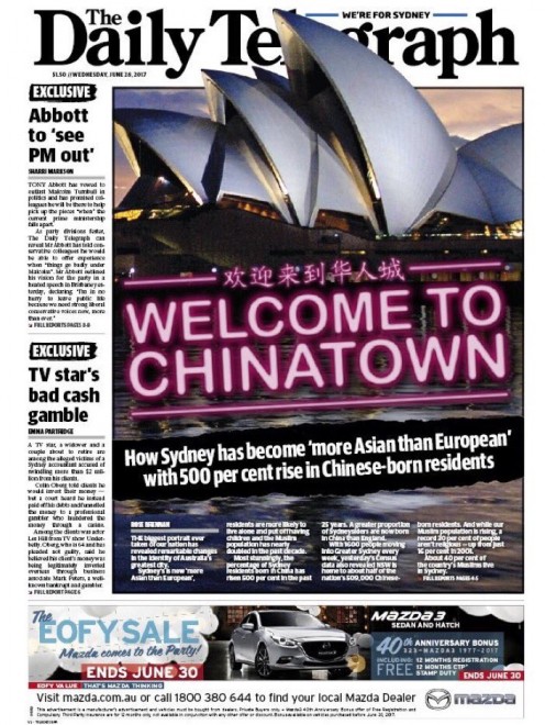
This morning The Daily Telegraph featured the census on its front page. Here’s what it looked like:

The paper managed to reduce the entire census to “Welcome to Chinatown” splashed over a picture of the Sydney Opera House. To make things even worse, they’re also being very slippery about the numbers. The latest census figures do not demonstrate that Sydney has become “more Asian than European”, which should seem obvious to anyone who has spent anytime in Sydney.
The actual story itself is a bit more nuanced than this absurdly provocative front page, but it still gives a pretty misleading impression of Sydney’s demographic makeup. It opens with “Australia’s greatest city is now more Chinese than British”, before citing figures that show “Chinese-born residents make up 4.7 percent of Sydney’s 4.8 million people compared to 3.1 percent from England.”
Ok, so we’ve already gone from “Sydney has become more Asian than European” to “There are more Chinese-born residents than English-born residents”. Interesting how Europe has subtly devolved into Britain, before the Tele eventually landed on England to help build its case.
But here’s the thing: zooming in on Chinese born residents versus English-born residents doesn’t really tell the whole picture. Fifty-seven percent of Sydney residents were born in Australia, so if we want to try and figure out what Sydney actually looks like, we need to take them into account as well.
And guess what! Four of the five most common ancestries for Sydney residents are Australian, Irish, Scottish and English. In fact, English ancestry is the most common background for Sydneysiders. And it’s more than twice as common as Chinese ancestry.
So while the proportion of Chinese born residents is increasing, Sydney is far from becoming “more Asian than European”. But that didn’t stop The Daily Telegraph‘s front page today, or this story yesterday along similar lines:
I thought this email from them yesterday was terrible but that front page is pure trash. pic.twitter.com/NvFvJZaApJ
— Lawrence Champness (@champy) June 27, 2017
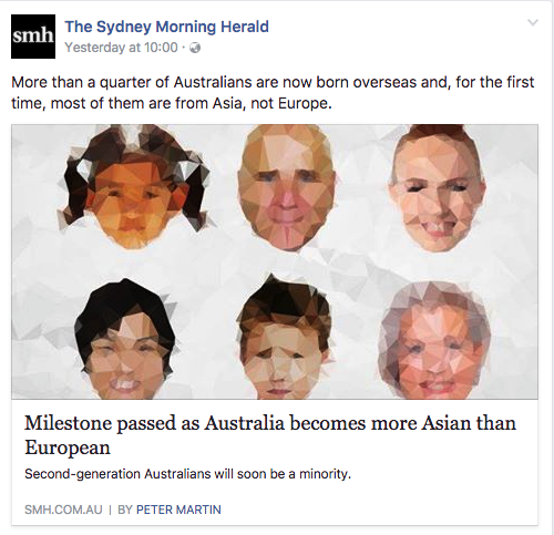
But it wasn’t just The Daily Telegraph running the “Asians are taking over” line. Check out this story from The Sydney Morning Herald:

As we’ve already seen it’s absolutely incorrect to claim Australia has become “more Asian than European”. The story itself is a bit clearer because it focuses specifically on what countries people are migrating to Australia from.
“China, India, the Philippines, Vietnam and Malaysia now account for more foreign-born residents than England, New Zealand and mainland Europe,” the article says. Which is true, and kind of makes sense when you consider where Australia is geographically located.

But the headline very strongly suggests Australia more generally, not just in terms of recent migrants, has become more Asian than European. Which is not the case.
Unfortunately, it gets even worse. Much like Pauline Hanson, our media managed to seamlessly pivot its inflammatory misrepresentation of Asians to Australia’s Muslim population.
The Muslims Are Coming!
One of the most interesting bits of information coming out of the 2016 census is the fact that people identifying as “no religion” have overtaken Catholics to become the single largest population group in the religious category. Thirty percent of Australians now identify as “no religion”.
But again, because this is Australia and we absolutely love this shit, sections of the media decided to jump on the apparent “soaring” Muslim population instead. The front page Tele story talked up a “doubling” of the Muslim population over the past decade, from 340,000 to just over 600,000. First of all, even in raw terms, that’s not a doubling.
Secondly, given that Australia’s population has grown by 4 million people over that same period, it’s a very bad way to represent the data. The census actually shows that Muslims make up 2.6 percent of the population, up from 2.2 percent in 2011. A 0.4 percent seems hard to get excited about, but people certainly tried.
On Facebook, 7 News described the change as evidence “Islam is soaring” before amending the post to read “Islam is on the rise”:
Hey 7 News – nice editing of your Facebook post ? #census2016 #census pic.twitter.com/jUwwB61Vh2
— Monte Bovill (@montetuna) June 27, 2017
The Daily Mail figured out a way to spin the figures to suggest Islam was Australia’s “second-biggest” religion.
1 out of every 487 people you walk past today will be a Muslim, which is admittedly pretty terrifying if you are a bigoted cretin. pic.twitter.com/seSGshB73H
— marquelawyers (@marquelawyers) June 27, 2017
It’s true that once you exclude “no religion” and combine every Christian denomination Islam is the next biggest religion. But Christians make up 51 percent of the population. Muslims make up 2.6 percent, not that far ahead of Buddhists on 2.4 percent. It doesn’t seem like a particularly worthwhile comparison, especially since it just excludes the 30 percent of Australians with no religion.
Leave The Census Alone
We probably should have expected this. Even though the census is essentially just an innocuous collection of spreadsheets, there are lots of different ways to interpret the data. And as we’ve seen, that means media outlets with particular ideological obsessions can manipulate figures to push their agenda, or to create wildly inaccurate headlines.
The best thing to do is to play around with the data yourself. It’s pretty easy, and kind of addictive when you get used to it. You can also check out our wrap up of the most exciting bits of information, and if you want to go deeper and more local The Guardian as an awesome tool that lets you visualise how your suburb has changed over time.
And finally, a plea to the rest of the media: please, please don’t ruin great things by making them racist. There’s enough of that going on already.

